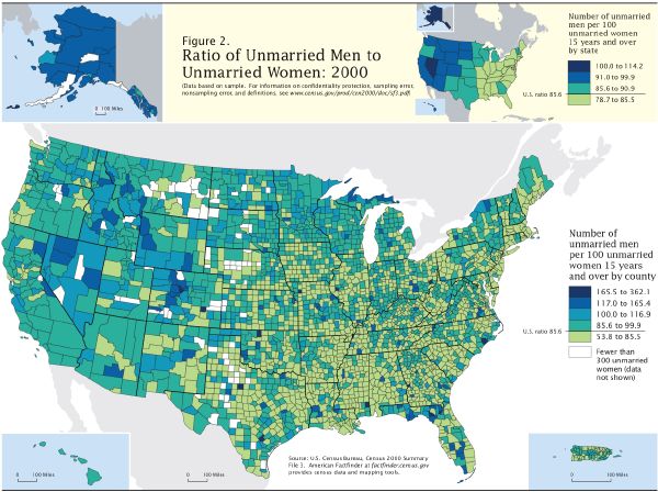
 Statistical maps display the distribution of a variable over a geographic area. The variable is presented as a statistic. This map shows the percentage of unmarried men to unmarried women in the US, by county. The counties with the largest disparities are clearly shown. I like this map because it is misleading; what you don't know is that the population of incarcerated men is included in the ratio, thereby giving the indication that certain areas have more of an imbalance than others.
 Tuesday, September 9, 2008
Statistical Map
Statistical maps display the distribution of a variable over a geographic area. The variable is presented as a statistic. This map shows the percentage of unmarried men to unmarried women in the US, by county. The counties with the largest disparities are clearly shown. I like this map because it is misleading; what you don't know is that the population of incarcerated men is included in the ratio, thereby giving the indication that certain areas have more of an imbalance than others.
Subscribe to:
Post Comments (Atom)

No comments:
Post a Comment