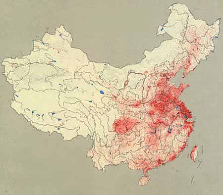
 A dot distribution map shows a density or occurrence of certain phenomenon or data, as well as the location they occur. This map is interesting because it shows the population distribution of China, the most populous country on earth. Each red dot represents 50,000 people; the areas where people reside is readily apparent.
Monday, September 1, 2008
Dot Distribution Map
A dot distribution map shows a density or occurrence of certain phenomenon or data, as well as the location they occur. This map is interesting because it shows the population distribution of China, the most populous country on earth. Each red dot represents 50,000 people; the areas where people reside is readily apparent.
Subscribe to:
Post Comments (Atom)

No comments:
Post a Comment