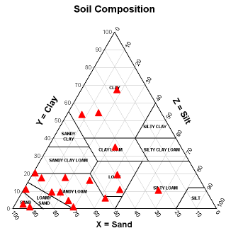
 A triangle plot is a graphical representation of three variable ratios. Each vertex represents 100% proportion of the variable to its left and 0% proportion of the one to its right. This plot describes the composition of a soil sample and what constitutes its makeup. It is apparent that sand is the majority element in this sample.
Tuesday, September 30, 2008
Triangle Plot
A triangle plot is a graphical representation of three variable ratios. Each vertex represents 100% proportion of the variable to its left and 0% proportion of the one to its right. This plot describes the composition of a soil sample and what constitutes its makeup. It is apparent that sand is the majority element in this sample.Index Value Plot
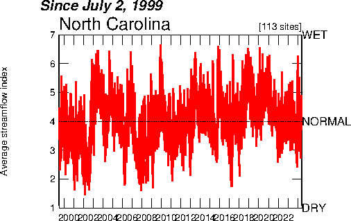 An index value plot measures data in terms of percentages rather than as absolute numbers. It is useful in displaying discrepancies between data. This plot describes the flow of a stream over a certain time frame; the highs and lows are easy to determine for a given period.
Scatterplot
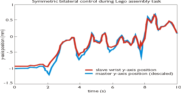
 A scatterplot reveals a correlation between two separate variables; the data is displayed as a collection of points. The data values determine the points placement on the horizontal and vertical axes. This plot is neat as the user has used it to predict a future action, and has incorporated that prediction into the plot.
Climograph
 A climograph graphically displays the monthly temperature and precipitation rates for a given location. Precipitation is depicted by use of a bar graph and temperature with a line graph. This is a climograph for a town in Brazil; the correlation between rain and temp. is easy to see with them being displayed together.
Sunday, September 28, 2008
Windrose
 A windrose is a graphic used to display how wind speed and direction are distributed at a particular location. It is a tool often used by meteorologists. This windrose displays the wind direction (North, West, East, South) and the speed at which it occurred, in meters per second.
 Population Profile
 A population profile is a graphic representation of demographic data. This graph describes all of the ages of a US county and how many individuals it constituted. This data was continued over a three decade period and is clearly evident.
 Bilateral Graph
 A bilateral graph represents both negative and positive data values in relation to a zero (mid) point. This graph is cool as it describes the accuracy of a mechanical arm in relation to the master control/template; the arm is 'slaved' to this control and receives directions from it. You can see from the graph how accurate the coordinated action is.
 Thursday, September 25, 2008
DOQQ
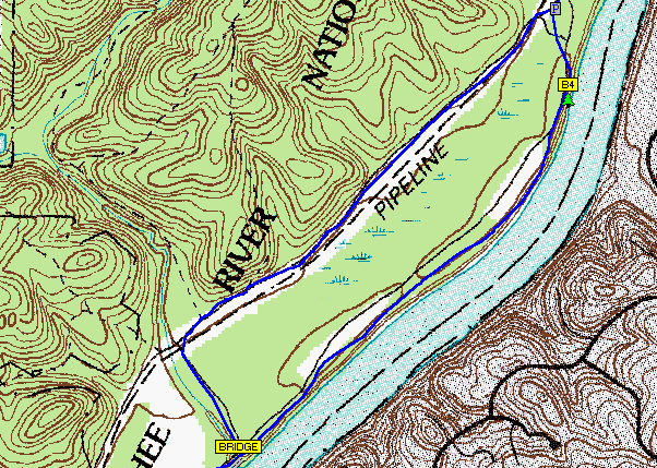
 A DOQQ (Digital Orthophoto Quarter Quad) is a computer image generated from an aerial photo. Unlike an aerial, planimetric features are in their true geographic positions as camera angle & relief have been corrected. This is essentially a photo-map, where distance can be measured.
 DEM
 A Digital Elevation Model (DEM) map is a dataset of digital cartographic/geographic elevations.
The data is typically obtained through remote sensing, such as satellites. This is a DEM of the island of Oahu; clearly seen are the differences in terrain elevation.
Friday, September 19, 2008
DLG

A DLG (Digital Line Graph) is a digital representation of features displayed on a US Geologic Survey map. It utilizes vectors rather than raster. This is a map of a geologic survey; the benefits of using digital are apparent in that the details are readily apparent.
Thursday, September 18, 2008
DRG
 A DRG (digital raster image) is a scanned image of a US geological survey topographic map. It is geo-referenced to the surface of the Earth and is fit to the Universal Transverse Mercator projection.
 Isopleth
 An isopleth map is used to describe information that shares a common value of a measurable quantity; it does this by use of a joining line. This is an isopleth of the total precipitation levels in the U.S. for a given year. You can quickly determine the areas that realize increased levels of rainfall in relation to others.
Isopach
 An isopach map measures the thickness of stratified layers in the Earth's surface and sub-surface. Geologists frequently use these types of maps. This is an isopach of the moon, showing various thicknesses of its surface.
Wednesday, September 17, 2008
Isohyet
 Isohyetal maps show precipitation. They do this by using a solid line that joins points of equal precipitation. This map is easy to read as the varying amounts of rainfall are color-coded and there is a legend to reference.
 Sunday, September 14, 2008
Isotach
 Isotachs are maps showing wind speeds. They do this with lines; speeds of equal measurement being enclosed. This is an isotach map showing the associated weather front causing the winds that are displayed.
Infrared Aerial Photograph
 Infrared sensors detect a certain portion of the light spectrum and photographs can be produced with the resulting image. This technology is useful in detecting and documenting changes to the environment. This is an infrared of an archipelago; clearly seen are the different types of natural habitat and their relation to one another.
Friday, September 12, 2008
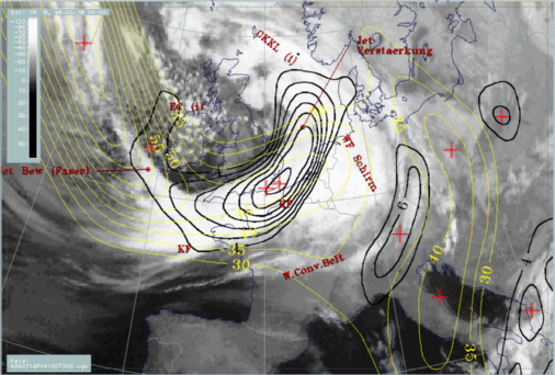
Isobar Map
 An isobar is a line of constant or equal barometric pressure, displayed on a map. These can be useful to meteorologists as they help to determine weather patterns. This is a map of isobars and various weather fronts associated with them over west Europe.
Thursday, September 11, 2008
LIDAR
 LIDAR uses laser pulses to detect objects; the data captured is then used to create a map. This process is effective in modeling vertical structure and is very accurate. This is an image of a terrain feature, showing elevation and depression, plus the grids that were used to map the returns.
Tuesday, September 9, 2008
Cartographic Animation
 A cartographic animations' goal is to depict change, usually over a period of time. It does so by displaying the variable graphically. This is a great example of an urban area being flooded, and just as importantly, where the water level is predicted to be at certain levels.
Statistical Map
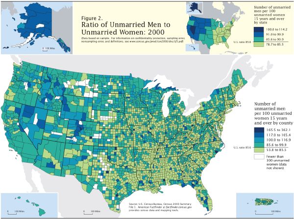 Statistical maps display the distribution of a variable over a geographic area. The variable is presented as a statistic. This map shows the percentage of unmarried men to unmarried women in the US, by county. The counties with the largest disparities are clearly shown. I like this map because it is misleading; what you don't know is that the population of incarcerated men is included in the ratio, thereby giving the indication that certain areas have more of an imbalance than others.
 Cartogram Map
 Cartogram maps substitute land area accuracy for a variable. The result is a distorted view of actual land area but the data can be read effectively. This cartogram is of the United States with each counties population size determining the shape. It shows the 2004 presidential election, red being Republican and blue being Democrat, and how they voted.
Sunday, September 7, 2008
Doppler Radar
 For civilian purposes, a Doppler radar map typically displays precipitation by use of the Pulse-Doppler radar technique. Doppler can also determine the directional motion of the phenomenon, object, etc. This is a Doppler view of Hurricane Ivan as it came ashore along the Gulf Coast. The image shows the severity of the rainfall and the relative areas affected.
 Isoline Map
 An isoline map utilizes continuous lines to describe a data set. The map depicted here is simple but effectively explains the definition given. This map shows the temperature variations over North Carolina on a given day. One can easily determine which areas of the state are affected by different temp's, and what those temperatures are per the legend.
 Thursday, September 4, 2008
Proportional Circle Map
 A proportional circle map uses circle size and placement to display frequency or the number of a variable. Circle size increases as the variable increases. This is a map of the Mediterranean Sea and the tsunamigenic events over the last 500 years. The size of the circle is directly proportional to the events magnitude.
Choropleth Map
 The choropleth map displays data across an area by use of colors or shading, this being in proportion to the measurement of the variable. This makes the information easy to visualize because you can see how it changes across a region. This map of Australia is a good example as it is very easy to determine the different climates of this continent, and how they change from one to the next.
Tuesday, September 2, 2008
Hypsometric Map
 Hypsometric maps display relief with a sequence of colors, each one representing a different elevation. This portion of a map shows mountainous terrain with color tints expressing the extremes of elevation very effectively.
Topographic Map
 Topographic maps display changes in relief (elevation and depression). They also show man-made as well as natural terrain features(ridge, saddle, river, hills, etc.). Map colors also represent data, such as vegetation. This map is interesting as it is one I used while in the Army. I high-lighted the yellow grid numbers as this helps in low light environments and you can still see the route and corresponding checkpoints drawn in black.
Monday, September 1, 2008
Dot Distribution Map
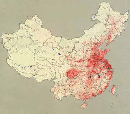 A dot distribution map shows a density or occurrence of certain phenomenon or data, as well as the location they occur. This map is interesting because it shows the population distribution of China, the most populous country on earth. Each red dot represents 50,000 people; the areas where people reside is readily apparent.
Black & White Aerial Photo
 Aerial photos can be used to describe a wide selection of subjects, including: structures, changes over time, vegetation, etc. The aircraft follows a determined flight line which translates into a number, corresponding with surrounding map sheets. I chose this photo mainly because of the level of detail at a scale of 1:40,000 but don't particularly care for the subject as it is that other school located in Gainesville.
 Planimetric Map
 Planimetric maps display terrain features horizontally while ignoring relief and elevation. This is an interesting map as it provides an accurate 'picture' of the terrain and other objects but does not address scale and height. To me, it almost resembles a mental map produced from individual perspective.
PLSS Map
 PLSS Maps (Public Land Survey System) are used to divide and organize lands owned by the the Federal Govt. for the benefit of the public domain. They are basically the opposite of cadastral maps, which deal with private ownership. This map is not the most exciting but I chose it because it clearly displays the division and classification of land parcels within this county by their numeric label.
Subscribe to:
Comments (Atom)
